Overview | Early History, Design and Construction of the Goodhue Building | Explanation of Themes and Inscriptions | Sculpture for the Goodhue Building | Painted Decoration in the Goodhue Building | Tom Bradley Wing: History and Design | Public Art Projects
Five major artworks were commissioned for the Central Library as part of the renovation and addition undertaken between 1986 and 1993. These new projects relate to the Tom Bradley’s Wing’s architecture in a manner quite different from art created for the Goodhue Building in the 1920s. Although the new artworks connect thematically to their library setting, they are strongly individual statements carrying the stamp of each artist’s conceptual and aesthetic concerns. They reflect both a popular acceptance of modernist emphasis on innovation and the changing circumstances under which public art was now commissioned.
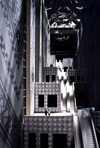
Tom Bradley Wing architect Norman Pfeiffer originally anticipated playing the role of art czar for both the new addition and the restored Goodhue Building. Responding to pressure to harmonize his new wing with the original library, Pfeiffer hoped to utilize design motifs from the old building’s decoration as the basis of new public art projects. He envisioned a wall-size tile mural inspired by the pyramid’s tile design and extensive use of stenciling that would evoke the stenciled ceiling decorations by Julian Garnsey that are such a feature of the Goodhue Building. At one point he also suggested portal designs for the new wing that would be similar to relief sculptures Lee Lawrie used to frame exterior doorways.
Hardy Holzman Pfeiffer Associates: Proposal for tile design for walls of the Tom Bradley Wing atrium
Pfeiffer’s plans came into conflict with a longstanding policy meant to encourage the creation of innovative contemporary art for public spaces in downtown Los Angeles. From the late 1960s on, what is generally called a “percent for art” initiative had been in place that required a percentage of redevelopment costs be dedicated to public art and cultural projects. By the mid-1980s an ordinance had been passed, city and county agencies were involved and procedures established for initiating projects and choosing artists. In 1988 the city’s Cultural Affairs Commission decided that as a city-owned building the library project was obliged to conform to this system.
A seven-person committee was created to oversee the development of projects and choice of artists. In addition to Pfeiffer, the committee included representatives of the library, the Cultural Affairs Commission, and Community Redevelopment Agency together with curators from the Los Angeles County Museum of Art and the Museum of Contemporary Art plus the director of an alternative art space. For most of the committee, showcasing contemporary art by Los Angeles artists became the top priority, trumping Pfeiffer’s desire to use art projects as a way of linking old and new parts of the building. (It should be noted that Pfeiffer was able to use designs of carpet, furniture, paneling, etc. to tie the new wing in with decorative arts from the original library building.)
The committee began by contacting a list of some two hundred artists, most local to Southern California, to see who might be interested in submitting proposals for artwork for the library. At the same time they worked to determine the type and location of projects--chandeliers and pole lamps for the atrium, surfaces of two new elevators, metalwork grills and a fence for the 5th Street courtyards, etc. Pfeiffer’s desire for a tile mural and extensive stenciling survived now as two of several projects.
A final list of eleven proposals was approved for the library. At the conclusion of the committee’s work in October of 1989 present budget existed for only five of the projects, but committee members anticipated the needed monies could be raised and the other six projects underway by the building’s completion date. These included painted panels and a huge clock to brighten the concrete walls at the east end of the atrium as well as Pfeiffer’s planned mural for the south wall. (Funding never happened, but those projects would still make an aesthetic difference if the money could be found.) Conscious of the city’s rich heritage of mural painting, the committee also hoped that in the future murals could be planned for the new wing.
Although the planning and selection process sounds bureaucratic, it resulted in a body of excellent art very effectively integrated into the library’s design. Prominently placed in public areas of the building, the artworks engage and animate their surroundings and reference the library’s function in subtle ways. The chosen projects encompass a variety of media and genres--painting, sculpture, decorative metalwork and conceptual art--yet they form a coherent whole.
Individual projects
Therman Statom Chandeliers, 1993
Therman Statom: Chandeliers
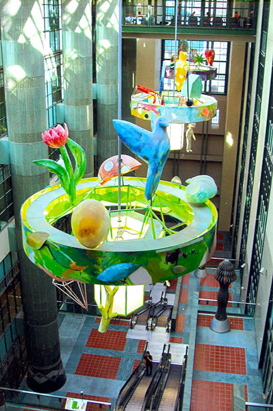
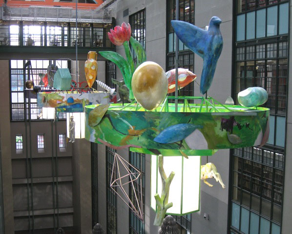
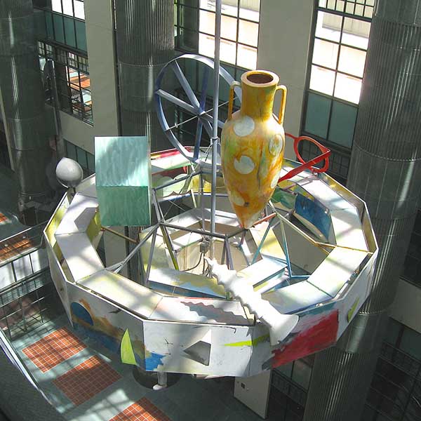
Three massive chandeliers created for the atrium were meant to echo Lee Lawrie’s Zodiac Chandelier in the Rotunda. Each is 18 feet in diameter and visually they dominate the upper part of Pfeiffer’s vast central space. The sculptor, Therman Statom, is one of the major figures of the late 20th-century Studio Glass Movement. Statom’s chandeliers are atypical of his work because, although proposed with glass components, they were executed in lighter, matte-surfaced materials due to the weight issue.
The project’s scale and concept are dramatic, even baroque, but that’s tempered by a child-like expressiveness that renders the trio of chandeliers rather playful. Statom chose a solemn theme--the natural, technological and metaphysical spheres of existence--and staged it with ensembles of huge fiberglass sculptures arranged on tiered concentric structures. Theme and scale are played off against a faux naive style that features intricate use of vivid color, and a surface treatment resembling papier mache counters the perception of size and weight. (Each chandelier weighs 1750 lbs.)
Therman Statom: Chandeliers, 1993
The first chandelier references nature with, among other things, a bird, a flower, a ladybug and an egg. In the second, eyeglasses, a quarter note, a ceramic jug and a silhouette-like model of a house symbolize material things and the culture of the everyday. (These objects, in particular, appeared frequently in Statom’s art of this period and call to mind oft-used components of Southern folk art.) The third chandelier features an angel, an hourglass, a heart and other symbols of abstraction and spirituality.
The placement of Statom’s chandeliers gives them maximum impact. In order to accentuate the height of his Rotunda dome, architect Bertram Goodhue surrounded it with low ceilinged corridors. Connecting the two wings, those same corridors now serve to dramatize the approach to Statom’s first chandelier suspended in Pfeiffer’s atrium. When initially seen down the corridor connecting the Goodhue Building and Bradley Wing from the Rotunda level, the near chandelier is visible simply as huge colored shapes. As one exits the corridor, a view of the atrium and chandelier opens up in dramatic fashion. Because of the large interior windows that on three levels line the south wall, one can walk along gaining close views of the three massive sculpted shapes. From below the chandeliers present a different aspect, resembling large lighting fixtures.
Ann Preston Illuminations
Ann Preston: lluminations, 1993
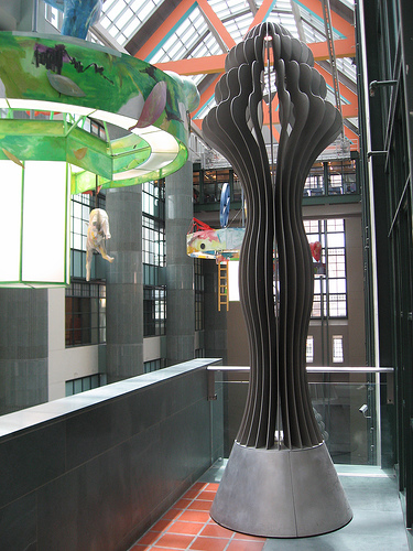
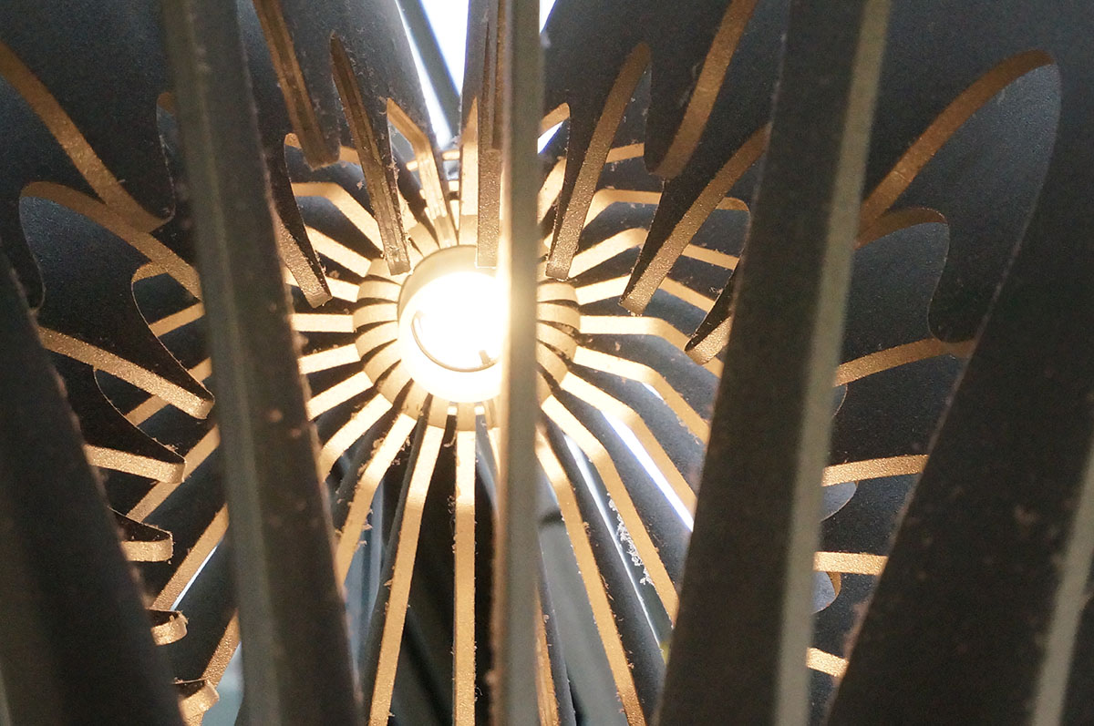
Sculptor Ann Preston received the commission for pole lamps specified in the project plans. She produced four 13 ft. high sculpted forms whose curvilinear shapes evoke multiple associations, most obviously with both lanterns and the human form. (They also bring to mind Lee Lawrie’s design of high table lamps for the History Room.) The artist herself refers to her sculptures as “feminized totems” and points out that they are meant to stand in contrast to the straight-edged right angled shapes that compose the atrium’s walls.
Ann Preston: lluminations (close up)
The scale and muscular shape of Preston’s sculptures gives them heft in the atrium’s vast space. But when approached the fact that they are composed of radiating vanes of brushed aluminum dissolves into an open, airy quality. Lit on the interior by a fixture embedded in the sculptures’ base and a small lamp at the top, they are particularly effective in the evening, seeming to become columns of softly reflected light.
Renee Petropoulos Seven Centers
Architect Norman Pfeiffer had hoped to make extensive use of stenciled decoration both in the new atrium and the renovated lower level of the Goodhue Building. He had envisioned what he termed “interpretive recreations of geometric stenciled artwork” (meaning patterns reminiscent of Garnsey’s ceilings) painted on the atrium’s skylight trusses and on the walls and ceiling of the lower lobby where Reader’s Services would now be located.
Renee Petropoulos: Seven Centers, 1993
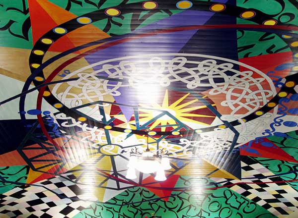
By the time of its execution the project had been reduced to the shallow domed ceiling of the lower lobby. Artist Renee Petropoulos adhered to Pfeiffer’s original concept by borrowing motifs from the old library’s decorative design but did not imitate Garnsey’s stenciling. Instead, she took various elements from the Rotunda including the sunburst on the ceiling, the silhouette of the Zodiac Chandelier and the checkerboard inlaid marble floors and combined them with other decorative elements, including patterned offset circles, into a painting entitled Seven Centers. Her artwork deliberately eschews symmetry. Instead, she expanded and compressed optical patterns and twisted straight lines into curves which sets the whole ceiling into motion. As a result, different viewpoints produce very different visual experiences.
In addition to the strongly graphic shapes, Petropoulos embedded areas of decorative calligraphy with names of young (in the 1980s) LA writers like Amy Gerstler, Bob Flanagan and Dennis Cooper. It would take a certain amount of patience to decipher chosen authors because first names are inscribed on the two east quadrants of the ceiling and surnames on the west quadrants.
David Bunn A Place for Everything and Everything in its Place
Conceptual artist David Bunn’s piece, A Place for Everything and Everything in its Place, is a take at once playful and serious on the library’s function as an ultimate source of systematically arranged information. While the Central Library was closed for rebuilding between 1986 and 1993, LAPL’s system completed the shift of its catalog from analog to digital and was planning to discard the old catalog cards.
David Bunn: A Place for Everything and Everything in its Place, 1993. Photograph courtesy of crala.org
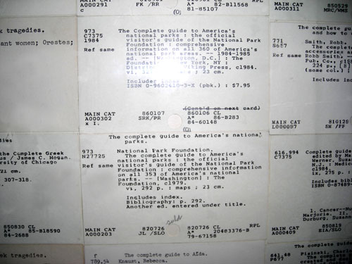
Bunn managed to acquire that archive of several million cards and used a selection for a project to be installed in the two new elevators serving the Bradley Wing’s eight levels.
The elevator cab walls were papered top to bottom with cards whose titles all began with “complete” or “comprehensive” but whose subjects were unrelated. It reminds anyone who has used a card catalog of the often amusing random juxtapositions that could occur when flipping through a title drawer. In addition, a porthole in each cab gives a view of more cards attached to the elevator shafts. Those reflect the collections of each library department on various levels. Bunn compared the elevators moving up and down through departments to a drill taking core samples from geological layers--the chosen cards being the samples.
Bunn went on to use the LAPL catalog cards in a number of projects over the next decade. During the mid-1990s, for example, he experimented with “card-poems”. Delving into his card files at randomly designated points, he extracted stacks of titles that read like a kind of ready-made concrete verse. In a later series entitled Subliminal Messages, he searched for cards that had evidence of use and tampering, then scanned his choices and made large-scale prints. Thus the library’s card files have achieved a sort of second life, blossoming from pure information into metaphor.
Ries Niemi The Literate Fence and The Children’s Courtyard
Ries Niemi: The Literate Fence, 1993
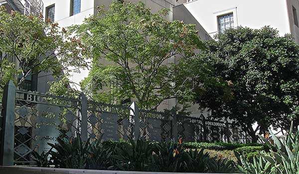
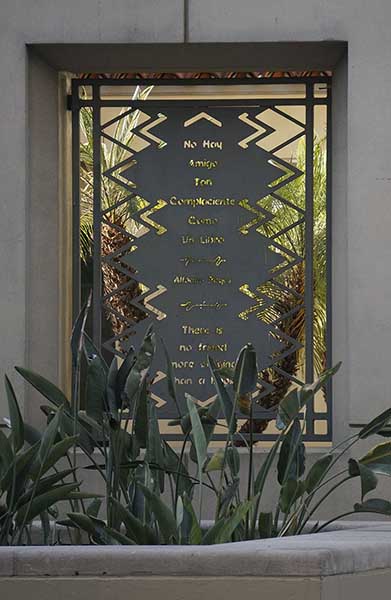
Ries Niemi designed and fabricated a 90-foot-long fence along 5th Street that borders a large courtyard adjacent to the Mark Taper Auditorium. Titled The Literate Fence, it functions as both a security device and a visual connector between the old and new library wings and makes thematic connections between the Goodhue Building and the new addition. Niemi’s fence is broken down into panels each carrying the name of a category of knowledge, for example biology, languages, philosophy and so on. It echoes similar terms inscribed on the entablature of the Hope Street facade. The artist also utilized multiple variations on zig-zag shapes that were so widely employed in the decorative embellishment of the Goodhue Building, right down to the pointed triangles that provide a security element.
Ries Niemi, grillwork for the Children’s Courtyard
In its center, each panel carries a quotation in a language widely spoken within local ethnic communities like Korean, Armenian, Arabic, Spanish and Hebrew. Chosen quotes refer to the library’s role in promoting reading and transmitting knowledge. Niemi was conscious of writing as both text and pattern and there is great decorative variety. Read the quotations.
His work continued with gates and grills crafted for the courtyard immediately adjacent to the Mark Taper Auditorium. This space is a replica of the original Children’s Courtyard which was located in the demolished East Wing. Sculpture by Lee Lawrie is preserved and installed here together with original tile planters. Niemi’s gates bear the sunburst pattern widely used in the old library and grills carry quotations from popular children’s books.
Ries Niemi is a metal worker and evidence of hand-craftsmanship is central to the aesthetic appeal of his work. While other sculpture projects for the new wing were fabricated at Peter Carlson and Company in the San Fernando Valley, all of the massive steel components of the Literate Fence and Children’s Courtyard were designed and produced by the artist working with one assistant in his small Inglewood studio.
