Overview | Early History, Design and Construction of the Goodhue Building | Explanation of Themes and Inscriptions | Sculpture for the Goodhue Building | Painted Decoration in the Goodhue Building | Tom Bradley Wing: History and Design | Public Art Projects
Architect Bertram Goodhue believed that painting and sculpture should play an important role in the design of public buildings. Just as relief and freestanding sculpture decorated the original library building, so ambitious painting projects were an important feature of the library’s interior. The ceilings of the rotunda and main reading rooms as well as smaller spaces were decorated with patterned motifs, and three sets of murals were commissioned from notable artists.
The library’s various painting projects were created under circumstances quite different from that of the sculpture. During his career, Goodhue worked with a number of well-known artists, but he never found a painter who could function in the role of close collaborator parallel to sculptor Lee Lawrie. So while Goodhue assumed Lawrie’s participation in the library from its inception, he does not seem to have had a particular painter in mind for the project. Thus Goodhue’s sudden death in April of 1924 left Carleton Winslow and other Goodhue associates plus the Library Board to decide on the specifics of the commissions and to hire what turned out to be several different artists.
Ceilings
One of the Goodhue Building’s most striking qualities is a contrast between the austere surfaces of the interior walls and the richly painted ceilings which, on the main level, remain mostly intact. Cost factors forced architect Bertram Goodhue to forego the use of decorative facing for walls and ceilings. Other than the occasional use of ceramic tile, limestone for sculpture and architectural details, and canvas for murals, the exterior and interior walls are obviously concrete or hollow tile construction with a coating of plaster or stucco. At some points, the ceiling of the lower lobby for example, actual plank patterns of the original molds were left evident. While the architect might have preferred to use masonry facing on the exterior and materials like mosaic on the interior as he did for Nebraska’s capitol, the quasi-industrial simplicity of his building is very attractive to modern eyes. Its painted decoration, originally chosen as an inexpensive expedient, honors the concrete’s austerity while giving it warmth and surface interest.
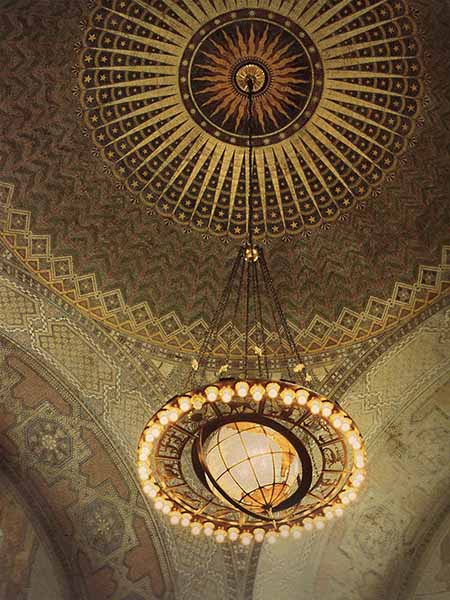
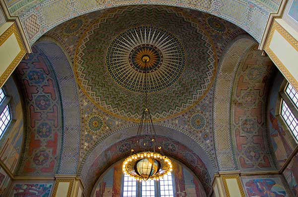
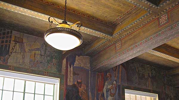
The artist whose bid won the ceiling commission was decorative painter and muralist Julian Garnsey. Garnsey may not have known Goodhue, but he had a keen appreciation for the distinctive quality of the library building’s design. In a 1927 interview, he described the library as “...a massive, simple structure, practically a concrete monolith, of honest, straightforward design. The construction is entirely visible--the beams are seen doing their work...” His aim was to create decorative designs absolutely integral to the shape and character of those strongly articulated structural components. To that end he decided to paint directly on the ceiling surfaces and to employ a technique called stenciling that applies paint through a pattern cut in a sheet of cardboard, metal, etc. ensuring consistent repetition of geometric shapes. This resulted in painted ornament that is flat and strongly geometric with a sophisticated color palette ranging in effect from muted to intense.
Julian Garnsey: Rotunda ceiling, 1926. Photograph courtesy of everywhereonce.com
The artist carefully calculated his ceiling designs in relation to one another and saw the whole project in terms of a hierarchy. Dominant was the Rotunda with its dome on pendentives soaring 64 ft. high, framed by four transept arches. A sunburst occupies the dome’s center, echoing a similar shape on the exterior pyramid. From that point, a blue canopy with stars expands outward and segues into intricate bands of interlaced zig-zags done in various colors. The pendentives are patterned with circles intended, as Garnsey put it to “hold apart the converging arches”. Cool tones of blue, green and violet predominate that in turn contrast with the warm colors used on the transept arches.
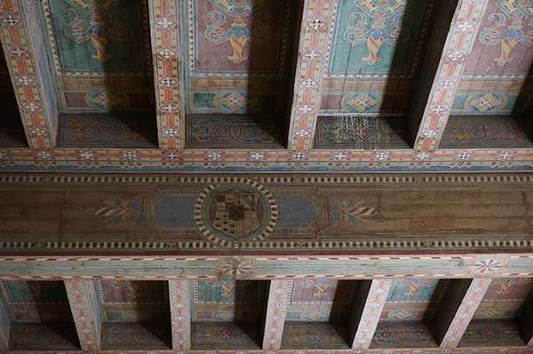
Next in import ranked the large Reference Room and the North Stair hall. The Reference Room ceiling was painted to resemble wooden coffering with major beams centered on shields decorated with coats of arms. Located directly across the Rotunda, the North Stair Hall ceiling was painted with vivid tones of red and blue.
Julian Garnsey: ceiling of Children’s Department, 1926, formerly the History Department. Photograph courtesy of Mary Valentine
Four main reading rooms occupied four corners of the original building, each with beamed ceilings done in strong geometric patterns based on circles, squares and crosses.
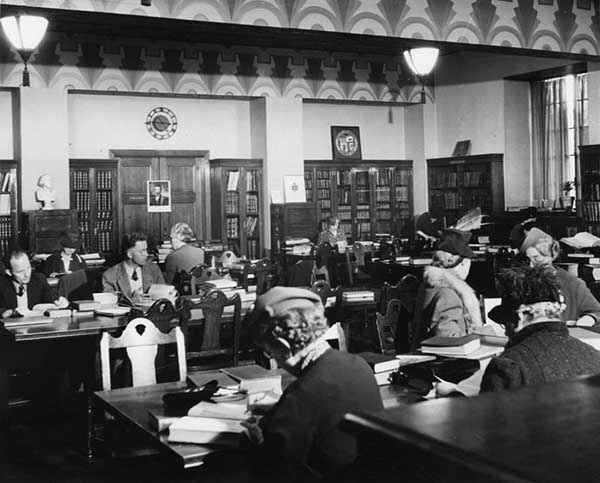
Genealogy Department of original library building. Photograph taken during the 1930s
Garnsey painted several other ceilings including entrance vestibules and the Art, Music and Teachers rooms in the (now demolished) East Wing. There are also records of artists John B Holtzclaw and Howard Verbeck having received commissions for ceilings, and old photographs show Art Deco-style ceilings in the Newspaper and Genealogy rooms. Those ceilings have either undergone extensive repainting (north and west vestibules) or no longer exist.
We must remember that decorative painting done directly on wall and ceiling surfaces is vulnerable. Water and fire damage, the need to open walls for repair work, etc. make it tempting to simply paint over damaged surface decoration. Over the years this seems to have happened on the library’s ground floor and mezzanine level in particular.
Murals
Children's Reading Room
During the late 1920s three large-scale mural projects were commissioned for the new library building. First completed was a series of scenes from Ivanhoe for the walls of the Children’s Reading Room, executed in early 1926 by Julian Garnsey and his associate A. W. Parsons. Originally part of the East Wing that was demolished during the late 1980s, the reading room has been preserved and incorporated (together with the Art Room above) into the new Bradley Wing. Wheelchair access has been added and the space is now utilized as a language lab, but the murals have been conserved in their original state.
Julian Garnsey and A.W. Parsons: The Tournament. Department of International Languages, formerly the Children’s Reading Room, 1926
The mural cycle depicts dramatic moments from Walter Scott’s novel of medieval Britain after the Third Crusade. With its celebration of chivalry, exposure of anti-Semitism and stories of Robin Hood and Richard the Lion-Hearted, Ivanhoe was popularly considered a classic of children’s literature during the 1920s.
Julian Garnsey and A.W. Parsons: Ivanhoe murals Department of International Languages, formerly the Children’s Reading Room, 1926
Conceived as a whole by Julian Garnsey, the reading room is a gem of decorative mural art. Bookcases are surmounted by continuous painted scenes that rise to the ceiling. Executed with skill and brio by A.W. Parsons, the individual scenes meld into a colorful panorama that circles the room. In turn, the beamed ceiling is treated as an elaborate illusion of wooden timbers meant to give the impression of a Norman castle. Patterned borders run along the top and bottom edges and surround the doorway to create a unified environment. Child scale wooden tables and chairs originally completed the whole.
History Room Murals
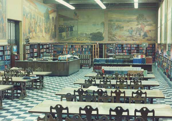
In 1927 bids were sought for the two important mural projects intended to complete the library: decoration for the tunnel leading from Hope St up to an elevator located one level down from the ground floor, and murals for the upper walls of the rotunda. In both cases, subjects were to be drawn from California’s past. It was the only aspect of the original library’s art program to focus on local history.
Albert Herter: Scenes from California History, the History Department. Photograph taken during the 1960s
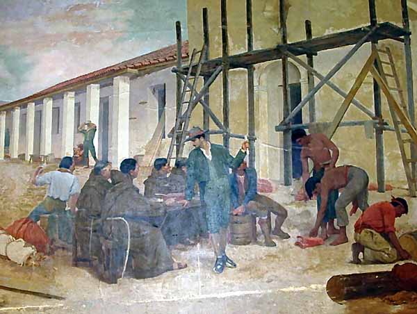
Albert Herter won the commission for the tunnel murals. Herter was a well-known muralist living in Santa Barbara who had already contributed work to an important Goodhue building, the National Academy of Science in Washington DC. The painter produced six scenes from what might be termed the standard 1920s version of California history with its themes of exploration, conquest and settlement:
The Landing of Cabrillo at Catalina Island, The Building of a Mission, Fiesta at a Mission, Raising the Flag at Monterey, Finding of Gold in ’49 and Relief Ship at San Diego.
All of the original paintings were composed as horizontal panoramic scenes so they would work visually against the tunnel walls. They featured groupings of figures arranged across the foreground with relatively simple backgrounds and a muted color palette. Viewed as one walked along within the confined space of a tunnel they must have been quite effective.
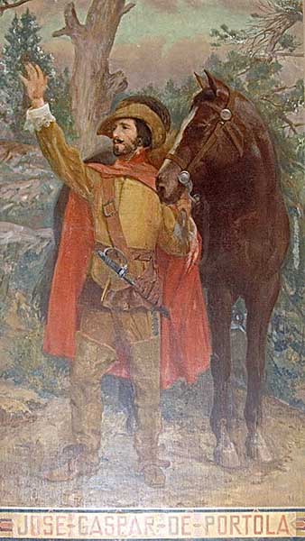
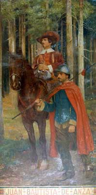
Soon after Herter’s paintings were attached to the tunnel walls, they began to suffer damage from seeping dampness. Within a year, the Library Board decided to remove all the paintings and have the artist reinstall them on the upper walls of the former Reference Room, now the History Room. In order to accommodate the dimensions of the room’s walls, the paintings had to be resized. Most drastically, the Relief Ship at San Diego was cut into eight pieces to fit between the windows on the south side of the room. Several of the paintings appear to have been reshaped from oblongs that tapered at one end to rectangles with more canvas having been added at the top and possibly sides--the most obvious example is the Landing of Cabrillo on the room’s west wall. Two new canvases depicting explorer Juan Bautista de Anza and Jose Gaspar de Portola, first governor of California, were added to fill empty walls around the doors.
Albert Herter: Building of the Missions, Children’s Department, c.1930
Now displayed in a setting quite different from what was originally intended, Herter’s works come across as somewhat awkward examples of academic history painting. But given that extra painting surface was literally tacked on without reworking compositions or pictorial space it seems unfair to judge these murals too negatively. The two added paintings work much better and are a fairer example of Herter’s abilities as an artist. But even with the problematic reworking of its murals, the room as a whole, like the Children’s Reading Room, is a stunning example of what mural painting can do to enrich a space.
Rotunda Murals
The Rotunda, Photograph taken during the 1930s
The commission for a major set of murals to decorate the rotunda went to Dean Cornwell, a celebrated illustrator who aimed to transform himself into a fine arts muralist. Cornwell won the plum commission in part because of his extremely low bid ($50,000) but largely because his proposal solved a difficulty presented by the rotunda’s design. All along there had been plans to decorate the rotunda with a large-scale mural cycle and possibly for that reason the walls were divided by cornice lines at about the fifteen and thirty-foot levels creating rectangular spaces around the room.
Most of the artists who submitted proposals limited themselves to those rectangles, but Cornwell incorporated the lunettes into his design thus unifying the entire upper wall. Six years later when his paintings were finally finished and installed, the now completed rotunda became the centerpiece Goodhue had planned for his library.
Dean Cornwell: The Founding of the Pueblo de los Angeles, 1933
Like Herter, Cornwell chose subjects typical of California’s history as written about and taught during the 1920s. But his treatment was more generalized and thematic and alternated specific historic moments with allegorical scenes.
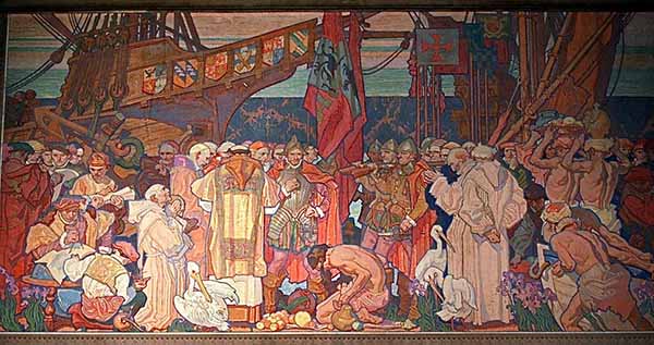
Dean Cornwell: The Landing of Cabrillo, 1933. Photograph courtesy of James Colligan
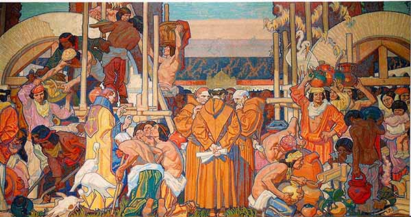
Four major panels, each 40 ft. wide, depict scenes from the state’s history: Cabrillo’s Discovery of California, the Building of the Missions, Founding of the Pueblo of Los Angeles and the Americanization of California. “Framing” each are two 12 by 19 ft. panels mounted on the double-faced piers that represent subjects symbolizing the elements and themes of education, invention and progress.
Dean Cornwell: The Building of the Missions, 1933. Photograph courtesy of James Colligan
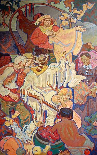
Cornwell evokes an idealized version of the state’s past in which Native Americans, Roman Catholic clergy, soldiers and settlers interact in a world free of conflict. In the Era of Discovery, frieze-like ranks of soldiers, priests and explorers stand grouped around a passively kneeling Indian figure. The scene of mission building focuses on three Franciscan padres in close discussion framed by groups of workers. Above the padres heads floats a small church. Is it an actual building located in the deep background or simply the idea of a building taking shape? The Founding of Los Angeles is an elaborate panorama centering on clergy and settlers. In contrast with the other three scenes, The Americanization of California is a complicated, crowded image depicting an era of rapid historical change. Lined up in the background hover the three modes of transport that brought settlers to California--locomotive, clipper ship, and covered wagon. In front, crowded groups of figures represent a historic mélange of everything from ‘49ers to fur traders to Mexican musicians and dancers to a group of elegantly gowned women and top-hatted men. The Native American presence is reduced to costumed stereotypes of a squaw and papoose and chief in (Plains Indian) headdress.
On the technical level, Cornwell’s library murals are an extraordinary achievement, especially for an artist undertaking his first mural commission. Exploiting his skills as an illustrator, the artist organized some 300 figures into narrative groupings and placed them in graceful compositions that manage both consistency and variety.
Dean Cornwell: The Americanization of California, 1933. Photograph courtesy of James Colligan
Cornwell was an expert in the most difficult aspect of mural painting: devising a coherent illusion that creates a feeling of three-dimensional reality yet takes into account the spectator’s viewpoint, in this instance located some twenty feet below the paintings. Treating each painting’s lower edge as a horizon line, he places objects along it like a ledge to give us a point of reference in relation to the space. Many of the foreground figures are positioned with their backs to us, drawing us into the paintings. And Cornwell deals with deep background space (which from this angle would be invisible to us) by abstracting and flattening it out or loading it with near detail. What results is a seemingly effortless integration of several viewpoints with two-dimensional pattern keeping order and selected moments of three-dimensionality connecting the paintings to the spectator’s space.
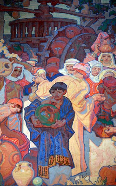
Dean Cornwell: Detail from Art
Critics and historians today generally regard the Central Library murals as the finest of Cornwell’s career. Here he achieved a balance between his tendencies as an illustrator--exaggerated stereotypes and stock poses--and a feeling for idealized form and intricate abstraction reminiscent of late Arts and Crafts and Art Nouveau-influenced visual design.
